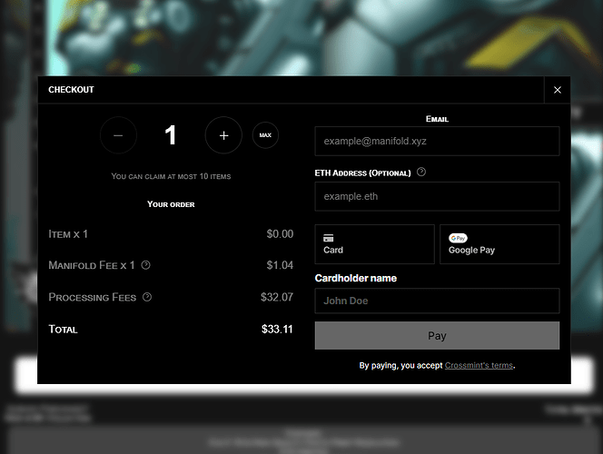
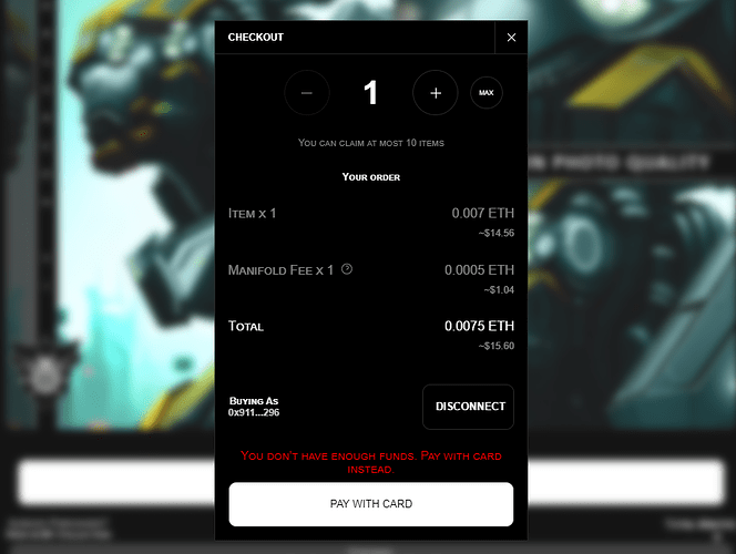
I noticed there are some things in the checkout experience using the Buy Now widget that really make checking out seem a bit sketchy and I fear I may have lost out on sales due to it simply due to the fact that I, as a consumer would be hesitant and deterred if presented with this on any other site than my own.
Problem 1 (Card Payments): I will look into this further in case it is a crossmint issue but the item price and processing fees are getting grouped together, and the item price appears as 0.00
Problem 2: Gas? I think a gas warning or at least an estimate would be appropriate. Checking out feels like getting hit with surprise and hidden fees even if you know and understand gas prices. Transparency is important. Customers need to know where the money is going and know that I’m not just sticking extra fees on top as the price doubles. ($15 “Total” becomes $30 in wallet)
Thanks!

