Hello!
For some reason, every time I mint an HTML page as an NFT, its frame displays taller than it should be on mobile on OpenSea. While I am able to control the size of the all the contents within the frame on OpenSea’s pages, and I can get everything to look right on desktop, there is always extra space at the bottom of the NFT on mobile that I just can’t get rid of.
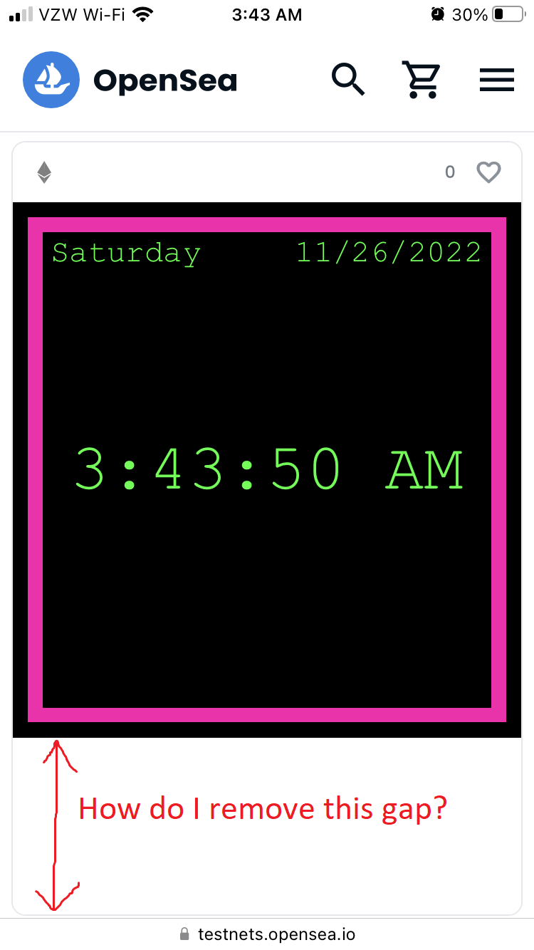
You can see an example here on my Clock NFT: https://testnets.opensea.io/assets/goerli/0x3ed9046b336318c7486c20eb71fe23ee646b9862/66
While the clock appears as a perfect square on both desktop and mobile, there is extra empty white space below the clock on mobile. I’m able to change the color of that white space by changing the back-ground color of the parental tag. However, any attempt to reduce the height of the entire frame, including changing the height of the tag, has no effect on the total size of the NFT.
No matter what I do, my HTML NFTs appear as vertical rectangles on OpenSea on mobile, even though I want them to be squares.
I’ve tried dozens of things, like setting the bottom padding to 0, hiding overflow, using negative bottom margins, etc. I’ve tried every CSS feature I can find to try and fix this problem, but nothing seems to work.
I would greatly appreciate ay suggestion you can offer me, because this issue really messes up the appearance of my HTML NFTs on OpenSea. Thank you for your time.
My code: it’s too large to fit everything here, so I’ll reply with all of my code.
HTML and CSS for the clock NFT above:
//index.html
<!DOCTYPE html>
<html lang="en">
    <head>
        <meta charset="UTF-8">
        <meta http-equiv="X-UA-Compatible" content="IE=edge">
        <meta name="viewport" content="width=device-width, initial scale=1.0">
        <title>Document</title>
        <div class="outerContainer" id="outerContainer">
            <div class="centerContainer" id="centerContainer">
                <link rel="stylesheet" href="styles.css">
                <div id="dateDiv" class="dateDiv"><pre id="dateText" class="dateText"> </pre></div>
                <div id="timeDiv" class="timeDiv"><pre id="timeText" class="timeText"> </pre></div>
                <script src="script.js"></script>
                <div id="bottomText" class="bottomText"><span id="bottom"> </span></div>
            </div>
        </div>
    </head>
</html>
//styles.css
:root {
    /*COLOR*/
    --color-pink: #ff00ae;
    --color-green: #00ff33;
}


html, body {
    margin: auto;
    height: 2160px;
    width: 2160px;
    max-width: 100vh;
    max-height: 100vh;
    background-color: #ffffff;
    position: relative;
}

.outerContainer {
    margin: auto;
    padding: 3% 3% 3% 3%;
    aspect-ratio: 1 / 1;
    background-color: #000000;
    position: absolute;
    top: 0; bottom: 0; right: 0; left: 0;
}

.outerContainer::after {
    display: block;
}

.centerContainer {
    padding: 3vh 3vh 3vh 3vh;
    margin: 0vh 0vh 0vh 0vh;
    aspect-ratio: 1 / 1;
    max-height: 100vh;
    max-width: 100vh;
    background-color: var(--color-green);
}

.dateDiv {
    padding: 3vh 3vh 3vh 3vh;
    margin: 0vh 0vh 0vh 0vh;
    height: 3vh;
    background-color: #000000;
    color: var(--color-green);
    display: flex;
    align-items: center;
    justify-content: center;
}

.dateText {
    height: 3vh;
    padding: 0vh 0vh 0vh 0vh;
    margin: 0vh 0vh 0vh 0vh;
    font-size: 6vh;
    color: var(--color-green);
    display: flex;
    align-items: center;
    justify-content: center;
    text-align: center;
    font-family: 'Courier New';
}


.timeDiv {
    height: 71.5vh;
    padding: 0vh 0vh 0vh 0vh;
    margin: 0vh 0vh 0vh 0vh;
    align-items: center;
    justify-content: center;
}

.timeText {
    margin: 0vh 0vh 0vh 0vh;
    padding: 0vh 0vh 0vh 0vh;
    height: 71.5vh;
    font-size: 13vh;
    color: var(--color-green);
    background-color: #000000;
    display: flex;
    align-items: center;
    justify-content: center;
    text-align: center;
    font-family: 'Courier New';
}

.bottomText {
    height: 3vh;
    font-size: 30px;
    padding: 0vh 0vh 4.5vh 0vh;
    margin: 0vh 0vh 0vh 0vh;
    background-color: #000000;
    color: var(--color-green);
    display: flex;
    align-items: center;
    justify-content: center;
    text-align: center;
    font-family: 'Courier New';
}


@media only screen and (max-width: 375px) {
    /* For phones */
    html, body {
        background-color: #ffffff;
        height: 100%;
        width: 100%;
        max-width: 100%;
        max-height: 100%;
        box-sizing: border-box;
    }


    .outerContainer {
        margin: 0% 0% 0% 0%;
        padding: 3% 3% 3% 3%;
        position: relative;
        box-sizing: border-box;
        top: 0; bottom: 0; right: 0; left: 0;
    }

    .centerContainer {
        margin: 0% 0% 0% 0%;
        padding: 3% 3% 3% 3%;
        max-height: 100%;
        max-width: 100%;
        position: relative;
        background-color: var(--color-pink);
        box-sizing: border-box;
    }

    .dateDiv {
        padding: 3% 3% 3% 3%;
        height: 3%;
    }

    .dateText {
        height: 3%;
        font-size: 140%;
    }

    .timeDiv {
        height: 91%;
        padding: 0% 0% 0% 0%;
        background-color: #000000;
    }

    .timeText {
        font-size: 290%;
        height: 91%;
        background-color: #000000;
    }

    .bottomText {
        height: 0%;
        background-color: #000000;
        padding-bottom: 0 !important;
    }
}

/* @media only screen and (max-width: 450px) {
    /* For phones */
    /*.center-container {
        margin-top: 3vh;
        background-color: #ff00ae;
        top: 50%;
        -ms-transform: translateY(-50%);
        transform: translateY(-50%);
    }
} */
Javascript and metadata for the Clock NFT above:
`use strict`;
//var datetime = new Date();
//console.log(datetime.toString());
//document.getElementById("time").textContent = datetime; //it will print on html page

//if( /Android|webOS|iPhone|iPad|iPod|BlackBerry|IEMobile|Opera Mini/i.test(navigator.userAgent) ) {
console.log(screen.width);
console.log(screen.height);
console.log(window.screen.width);
console.log(window.screen.height);
console.log(window.innerHeight);
console.log(window.innerHeight);
window.resizeBy(-250, -250);
console.log(screen.width);
console.log(screen.height);
console.log(window.screen.width);
console.log(window.screen.height);
console.log(window.innerHeight);
console.log(window.innerHeight);
//  const outerContainer = document.getElementById("outerContainer");
//  outerContainer.style.height = vw.toString() + "vw";
//  outerContainer.style.width = vw.toString() + "vw";
//}


// JS to use inner height of browser window
//let vh = window.innerHeight * 0.01;
//document.documentElement.style.setProperty('--vh', `${vh}px`);
// adjusts when device is turned
//window.addEventListener('resize', () => {
//  let vh = window.innerHeight * 0.01;
//  document.documentElement.style.setProperty('--vh', `${vh}px`);
//});
//CSS to use inner height of browser window
//height: calc(var(--vh, 1vh) * 100);


const dayArray = ["Sunday", "Monday", "Tuesday", "Wednesday", "Thursday", "Friday", "Saturday"];

const dateDisplay = document.getElementById("dateText");
const timeDisplay = document.getElementById("timeText");
const dateObject = new Date();
const dayNumber = dateObject.getDay();
const dayString = dayArray[dayNumber];
const dateTimeString = dateObject.toLocaleString();
const dateTimeArray = dateTimeString.split(", ");
const dateString = dateTimeArray[0];
const timeString = dateTimeArray[1];
const dayDateString = dayString + ' '.repeat(13 - dayString.length) + dateString;
dateDisplay.textContent = dayDateString;
timeDisplay.textContent = timeString;

`use strict`;
function refreshTime() {
  const dateDisplay = document.getElementById("dateText");
  const timeDisplay = document.getElementById("timeText");
  const dateObject = new Date();
  const dayNumber = dateObject.getDay();
  const dayString = dayArray[dayNumber];
  const dateTimeString = dateObject.toLocaleString();
  const dateTimeArray = dateTimeString.split(", ");
  const dateString = dateTimeArray[0];
  const timeString = dateTimeArray[1];
  const dayDateString = dayString + ' '.repeat(13 - dayString.length) + dateString;
  dateDisplay.textContent = dayDateString;
  timeDisplay.textContent = timeString;
}
  setInterval(refreshTime, 1000);
clock-metadata.json
{
    "attributes": [
      {
        "trait_type": "Edition",
        "value": "1st Edition"
      },
      {
        "trait_type": "Rarity",
        "value": "Legendary"
      },
      {
        "trait_type": "Sign",
        "value": "Scorpio"
      }
    ],
    "description": "Well would'ja look at the time!",
    "name": "Clock",
    "animation_url": "https://gateway.pinata.cloud/ipfs/QmNTuZD2MFnLRFEEMUv2WoQ9c2NfHSfga6wD77Uo1w9WTY/",
    "animation_details": {"format": "HTML"},
    "image": "https://gateway.pinata.cloud/ipfs/QmXTitWrk9bLTKi8LzxhmqPWTESKvudF3kLKEwuPPgDQLj"
  }
Hey hey! Not sure how much we can really help here… the CSS and iFrame settings that OpenSea uses is out of our control. On pieces I’ve worked on before, here’s something I’ve done that sometimes looks better
    <style>
      html, body {
        margin: 0;
        padding: 0;
        overflow: hidden;
        height: 812.5px;
      }
      img {
        position: absolute;
        top: 0%;
        left: 50%;
        transform: translate(-50%, 0%);
        height: 100%;
      }
    </style>
Of course adjust as relevant to you. I think it might just be the minimum size on OpenSea. Once you mint to mainnet, here’s what it will look like on Manifold Gallery.
Thank you for your reply! I tried what you said, but the issue persists on mobile on OpenSea. You might be right that this is a feature of OpenSea, and there’s nothing to be done about it.
Does your version have the white space below it on OpenSea on mobile?
Hey sorry I missed this. Yeah, seems like some sort of CSS on their end unfortunately!
Unfortunate. Thanks a ton for your help regardless!
If anyone does make a breakthrough on this, please let me know!
Happy holidays, all! ^_____^