Hello,
I’ve found that tokens with animation_url are being displayed inconsistently across Manifold’s pages.
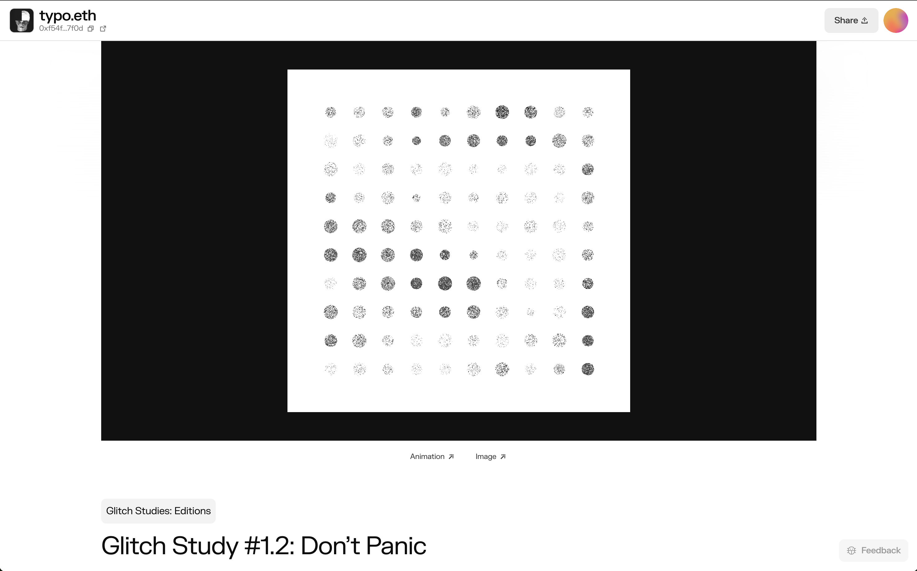
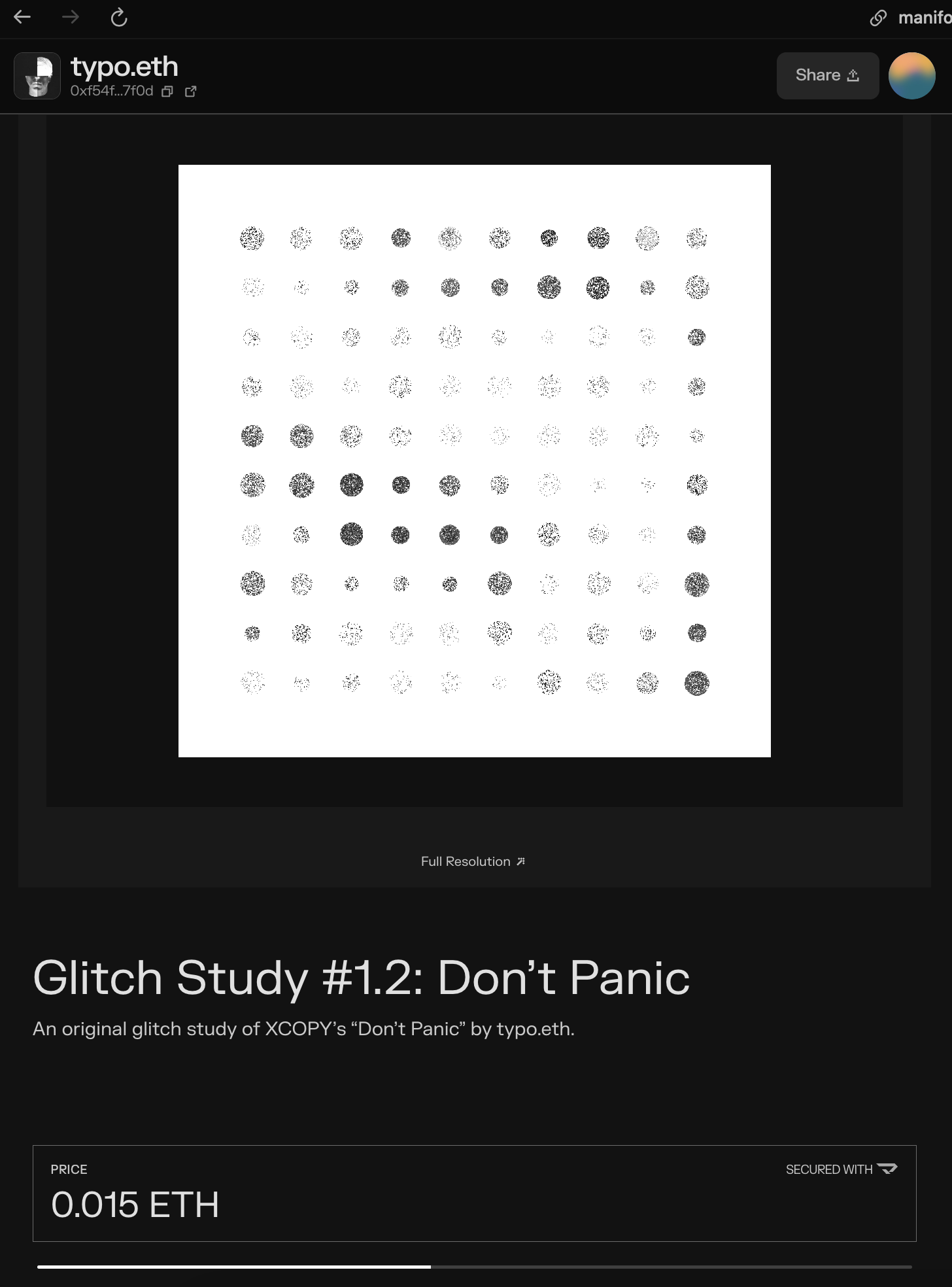
These tokens linked from a Curate page display as expected:
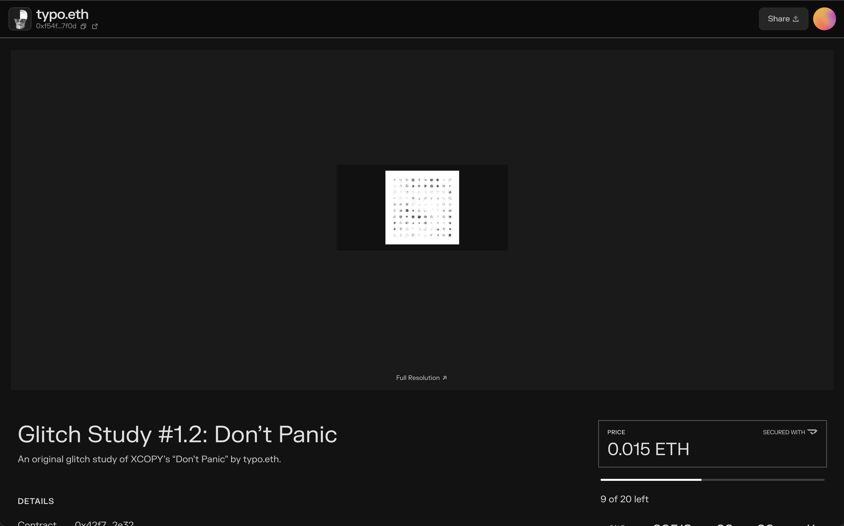
The same tokens in their listings context look terrible:
Example screenshots below. Please make these layouts appear good and consistent.
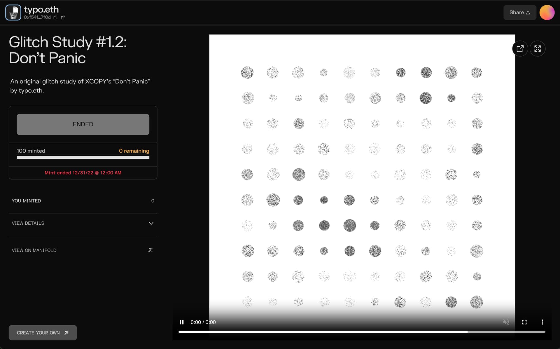
Why are there so many layouts for token pages? It’s confusing and makes for a terrible experience. So much could be simplified and made consistent. The claim page is another example of the same token but in this context the animation_url which features HTML is converted into a video. I don’t get it.