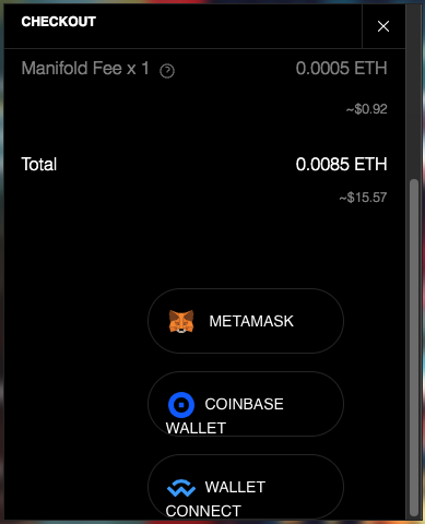
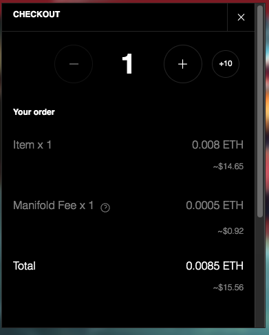
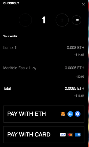
Trying the claim page widget on our site. Seems to be working great, just some UI elements that aren’t matching 1:1 with the native manifold page. Did I forget a dependency or something? I’m not much of a dev.


The pay with ETH flow also shortens the height of the modal and therefore hides the wallet connection buttons. The credit card flow seems OK.
I’m also seeing the hyperlink line break issue in the widget (it’s resolved on the native claim)

Can you try updating to 1.7.4?
Updated the JS and CSS to 1.7.4. Looks about the same except for the line break issue, which is fixed but still doesn’t render the link styles as in the app.
I see you have the connect widget’s CSS - https://connect.manifoldxyz.dev/3.1.0/connect.css . I think you’ll actually want to remove it. Claims widget CSS will handle styling for the connect button
Removing just that one took away the wallet integration buttons, but removing both https://connect.manifoldxyz.dev/3.1.0/connect.css and https://connect.manifoldxyz.dev/3.1.0/connect.manifold-dark.css in addition to removing my m-connect widget from the body seemed to work.
Still some slight font size and link style issues in the claimComplete widget, but the modal height and width issues are resolved. Thanks for your help!
No problem! Yeah basically if you have the claim widget, you do not want connect CSS since it overrides it all
