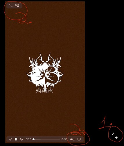
I minted a music video on Manifold via a claim page. The video playback is a bit wonky both on desktop and mobile but especially on mobile. Currently on both, there are two sets of buttons that allows you to expand to full screen and mute/unmute. One is built into the embed window (2 in the included picture) and the other is overlaid (1 in the picture).
The 2’s work perfectly fine and you can full screen and unmute intuitively using those, however, when you fullscreen using 1 on both desktop and mobile, it opens up a new popup window where the video begins playing while still playing the video in the original window as well. If you unmute the original video using 2 then fullscreen using the bigger 1 fullscreen button, you end up with mismatched audio running on top of itself.
Then on mobile specifically:
- if you fullscreen using 1, the unmute for the new pop’d up video doesn’t work.
- If your visual is a vertical video, the unmute button is underneath the fullscreen button
.
I think all of this gets solved if you simply remove the functionality for popping out the video into a new screen (the 1’s). It seems that the player window already includes any functionality a viewer would want.
Please consider fixing this! I love using the claim page and appreciate what ya’ll are building. It’s a huge unlock. But in a lot of cases people are viewing my pieces for the first time on the claim page and that kind UI friction can really affect the experience.

